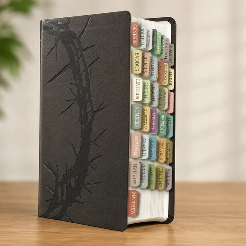
I met this Bible on a Tuesday night, the kind where sleep felt impossible. I was halfway through a frustrating stretch of devotional reading, using a phone app that kept dimming at the worst moments. My eyes were tired, and honestly, I was tired of the glow. I wanted paper. I wanted something I could hold. When I unpacked this bundle, the charcoal LeatherTouch cover caught the lamplight, and for a second, I just sat there with it closed. The question in my head was simple: would a physical Bible with tabs and red letters actually change the way I read, or was I just buying a prettier version of the same routine?
The real star here is the Pure Cambridge Edition of the King James Version. It’s formal, majestic, and unapologetically archaic. Reading it is not like reading a modern paraphrase. It’s like stepping into a cathedral where the language is stained glass—beautiful but requiring you to look at it from the right angle. I opened to the Gospel of John, and the red letters for Christ’s words jumped off the page in a way that felt immediate, even though I know these stories well enough to recite them. The 11.25-point type is genuinely large. I didn’t have to squint, and that matters more than I expected. The two-column verse-by-verse format keeps everything structured, but it’s the cross-references at the ends of paragraphs that pulled me deeper. I found myself on a chain of thought, bouncing from a verse in Romans to a marginal note that sent me to Isaiah, and then back again. It wasn’t linear, but it felt like real study.
The Language That Makes You Pause
The KJV’s language is powerful, but it’s also a barrier for some readers. The translation is not going to hand you its meaning easily. You have to work for it, and the work is part of the reward. I read a passage in Ecclesiastes, and the phrasing of “vanity of vanities” hit me with a weight that a modern translation often smooths away. This Bible is for the person who wants that weight.
What struck me most was the tabs, and I’ll be honest about them. I almost didn’t apply them. The idea of sticking seventy-five laminated pieces into a new Bible felt like a commitment, a permanent choice. Then I used the included alignment guide and just did it. The boho color palette is not my usual aesthetic, but the functionality is undeniable. Now I can flip to Lamentations or Jude without fumbling. It’s a small thing, but it removes friction. The whole point of this bundle is accessibility—making the King James Version approachable without dumbing it down. The red lettering itself, the blood-colored words of Christ sitting on the charcoal background, is a visual reminder that this text is alive, that it demands a response, not just a reading.
The Trade-Offs Worth Knowing
There is a problem with this Bible, and I need to be fair about it. The LeatherTouch cover is soft and pleasant, but it is not leather. If you are looking for an heirloom-quality binding that will last fifty years, this might not be it. The Smyth-sewn binding is good, and it lays flat beautifully, but the cover is a compromise for the price. Also, the KJV is not the right translation for everyone. If you are new to Scripture and struggle with Elizabethan English, this will be a challenge. It isn’t the easiest path. It’s the more scenic one.
This Bible is for the pastor who needs a reliable study copy, the grandmother who needs large print, or the teenager who wants a beautiful gift for a baptism. It’s not for someone who wants a conversational, easy-to-digest reading experience on day one. That reader should look at the NIV or the ESV.
After a week of using this bundle, I realize I haven’t touched my phone app. The act of flipping to a tab, of using my fingers to find a book, of seeing the red letters against the dark cover—it slowed me down. The Bible didn’t change the words, but it changed my posture. I wasn’t scrolling. I was searching. The moment that shook me came on the third morning. I was reading the Sermon on the Mount, and the red letters of the Beatitudes felt less like instructions and more like a mirror. I had to put the book down for a minute.
A clearer sense that the medium matters. The format of this Bible—the tabs, the large type, the cross-references—all work to keep you inside the text longer. The best gift this bundle gives you is not the convenience. It’s the permission to linger. The translation will make you pause. The red letters will make you focus. The tabs will make you curious about books you usually skip. The cover is a bit fragile and the language is a bit hard, but those are honest trade-offs. This Bible won’t make you a better person overnight. It will, however, make you feel slightly less alone in the quiet moments of the morning, when the world is still and the pages are open.